
elite home creations
elite home creations
elite home creations
Elite Home Creations is a business that specializes in transforming homes into stylish, functional, and comfortable spaces tailored to customers needs.
Elite Home Creations is a business that specializes in transforming homes into stylish, functional, and comfortable spaces tailored to customers needs.
Project overview
Visual Identity Design
Project overview
Visual Identity Design
role
Brand Designer
role
Brand Designer

making a good name
making a good name
My client approached me for a visual identity, but I noticed the brand name—Elite Bath and Home Creations—was too long to be memorable. Since they plan to focus on bathroom remodeling short-term, I recommended shortening the name to 'Elite Home Creations' for better recall and long-term positioning, while using messaging and marketing to highlight their current specialty.
My client approached me for a visual identity, but I noticed the brand name—Elite Bath and Home Creations—was too long to be memorable. Since they plan to focus on bathroom remodeling short-term, I recommended shortening the name to 'Elite Home Creations' for better recall and long-term positioning, while using messaging and marketing to highlight their current specialty.
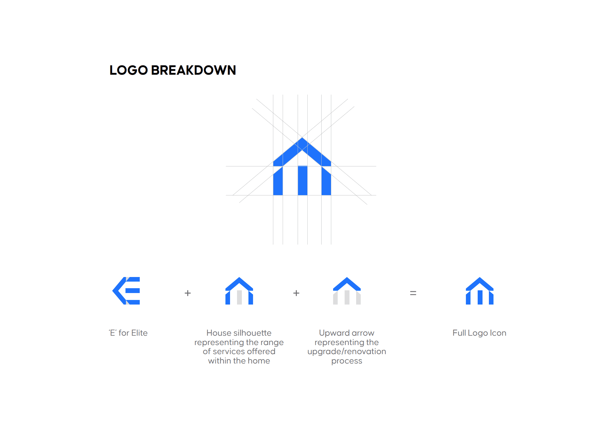
exploring logo directions
exploring logo directions
After a discovery call with the client, I was able to understand what they needed, which was a logo identity that communicated their service, trust, and simplicity.
And in the end, they went with the second submission.
After a discovery call with the client, I was able to understand what they needed, which was a logo identity that communicated their service, trust, and simplicity.
And in the end, they went with the second submission.


curating the colour palette
curating the colour palette
I chose blue as the primary colour for its association with trust and how well it complemented the logo. To build a versatile palette, I added light and dark shades of blue, along with neutral tones—white and black—for balance and flexibility.
I chose blue as the primary colour for its association with trust and how well it complemented the logo. To build a versatile palette, I added light and dark shades of blue, along with neutral tones—white and black—for balance and flexibility.
typograhy
typograhy
Lexend Giga was chosen for its clean, corporate feel and friendly character, making it perfect for the brand’s tone.
Lexend Giga was chosen for its clean, corporate feel and friendly character, making it perfect for the brand’s tone.
Visual identity in action
Visual identity in action
What’s a visual identity without seeing it come to life?
What’s a visual identity without seeing it come to life?


Creating a presentation slide
Creating a presentation slide
I also designed an interactive pitch deck to help them connect with potential clients.
I also designed an interactive pitch deck to help them connect with potential clients.


View other Branding Projects
2018

2018
2018
2018
2018
2018
2018
2018


View other
Branding Projects
2018
2018
2018
2018
2018
2018
2018
2018

View other Branding Projects
2018
2018
2018
2018
2018
2018
2018
2018
View other Branding Projects
2018
2018
2018
2018
2018
2018
2018
2018