

Imperial Lane
Imperial Lane
Imperial Lane
Imperial Lane, is an online gourmet food establishment, that specializes in delectable, health-conscious snacks and meals, providing royal treatment for each customer.
I crafted an identity that deeply resonated with their target audience throughout their interactions with the brand and drove successful sales.
Project overview
Logo Design & Brand Identity
Brand Packaging
Marketing Collateral
Project overview
Logo Design & Brand Identity
Brand Packaging
Marketing Collateral
role
Brand Designer
role
Brand Designer

baking the logo
baking the logo
I knew I wanted the logo to be artistic, so I had a conversation with the owner to be sure it aligned with what she was trying to achieve with the brand, and it did.
I knew I wanted the logo to be artistic, so I had a conversation with the owner to be sure it aligned with what she was trying to achieve with the brand, and it did.
I went ahead to create a doodle themed logo that emphasized royalty (the way customers would be treated) and the excitement food lovers usually can't contain.
I went ahead to create a doodle themed logo that emphasized royalty (the way customers would be treated) and the excitement food lovers usually can't contain.

curating the colour palette
curating the colour palette
My choice of brand colors was deliberate. Purple symbolizes regality and sophistication, while yellow holds cultural significance, signifying the vibrant world of food.
And white? White always brightens things up, and we don't want dull colours for an exciting experience do we?
My choice of brand colors was deliberate. Purple symbolizes regality and sophistication, while yellow holds cultural significance, signifying the vibrant world of food.
And white? White always brightens things up, and we don't want dull colours for an exciting experience do we?

What about Typography?
What about Typography?
The typeface used in the logo couldn't work for basic type across other assets, so I had to look for another that felt fun and worked. And Comfortaa fit the bill.
The typeface used in the logo couldn't work for basic type across other assets, so I had to look for another that felt fun and worked. And Comfortaa fit the bill.

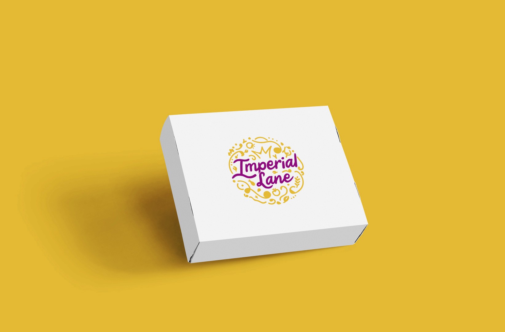
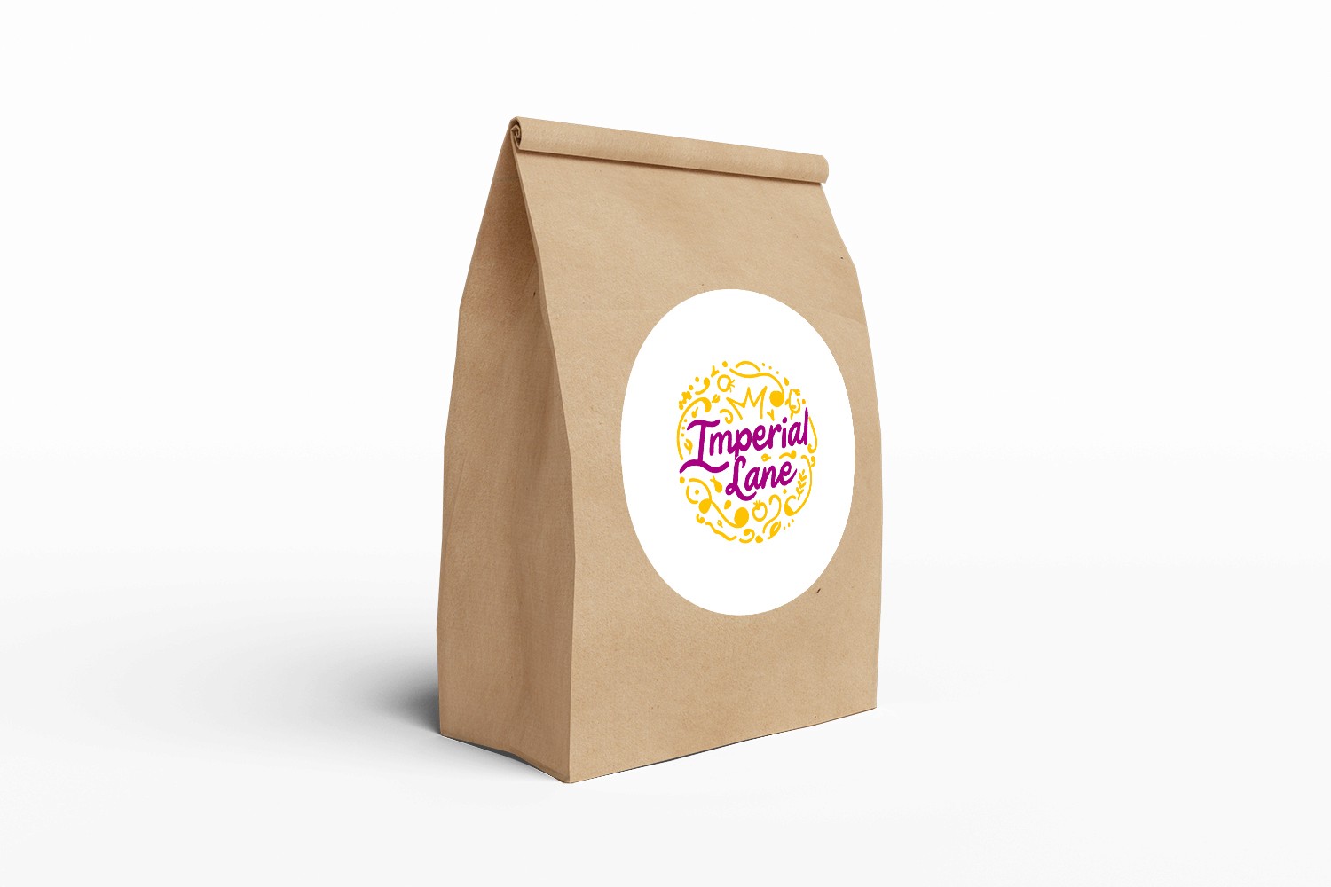
How do you package a royal food brand?
How do you package
a royal food brand?
Simplicity. The packaging was built on the idea that royalty in our time means simplicity.
Simplicity. The packaging was built on the idea that royalty in our time means simplicity.
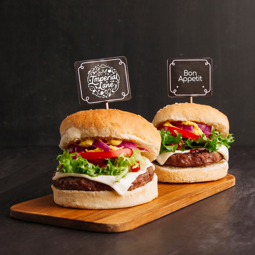

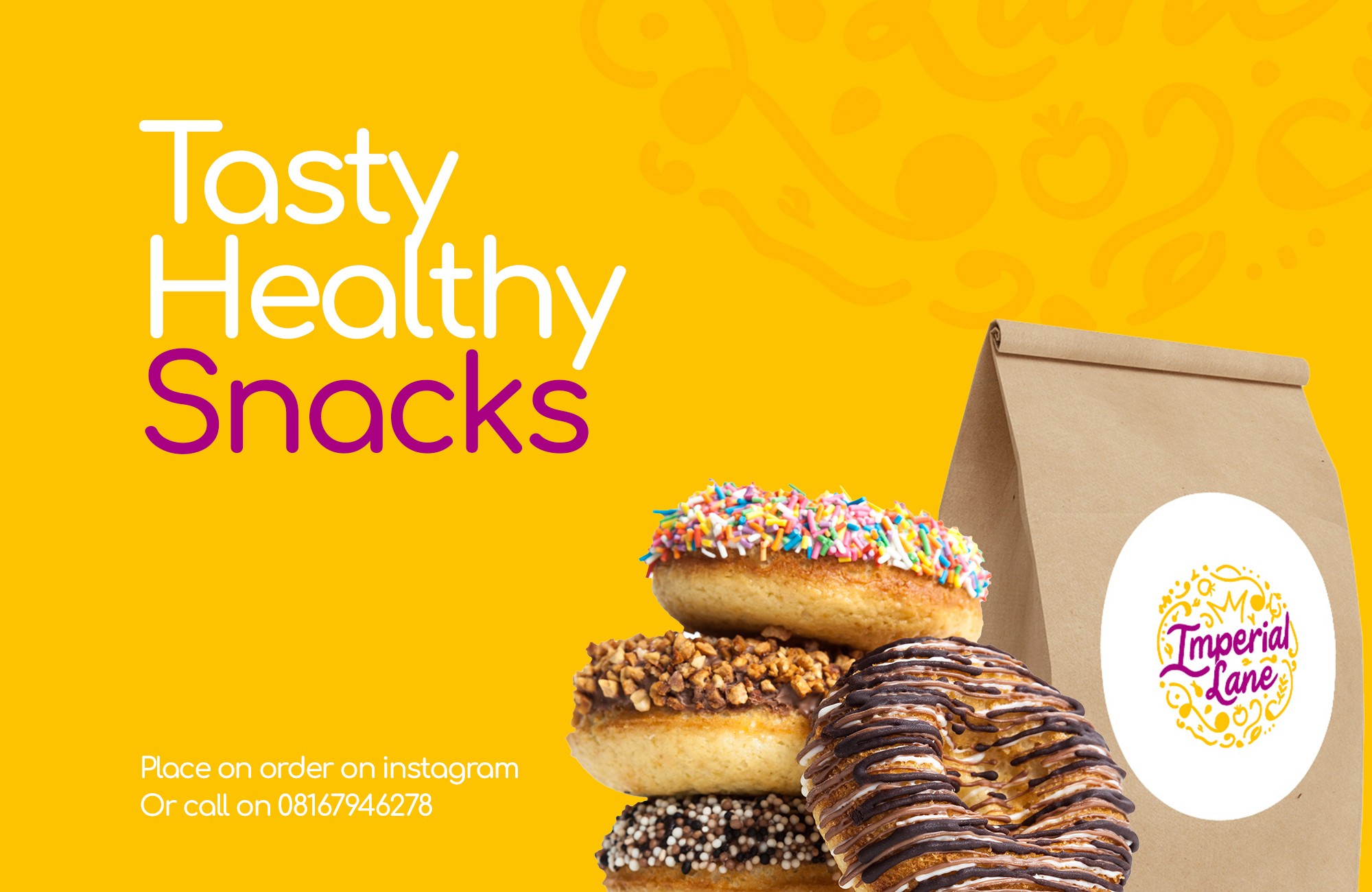
developing collateral
developing collateral
developing collateral
The brand needed some collateral to get things started, and I was glad to be able to extend the logo identity to some brand assets.
The brand needed some collateral to get things started, and I was glad to be able to extend the logo identity to some brand assets.
The brand needed some collateral to get things started, and I was glad to be able to extend the logo identity to some brand assets.

View other Branding Projects
2018

2018
2018
2018
2018
2018
2018
2018


View other Branding Projects
2018
2018
2018
2018
2018
2018
2018
2018
View other
Branding Projects
2018
2018
2018
2018
2018
2018
2018
2018

View other
Branding Projects
2018
2018
2018
2018
2018
2018
2018
2018